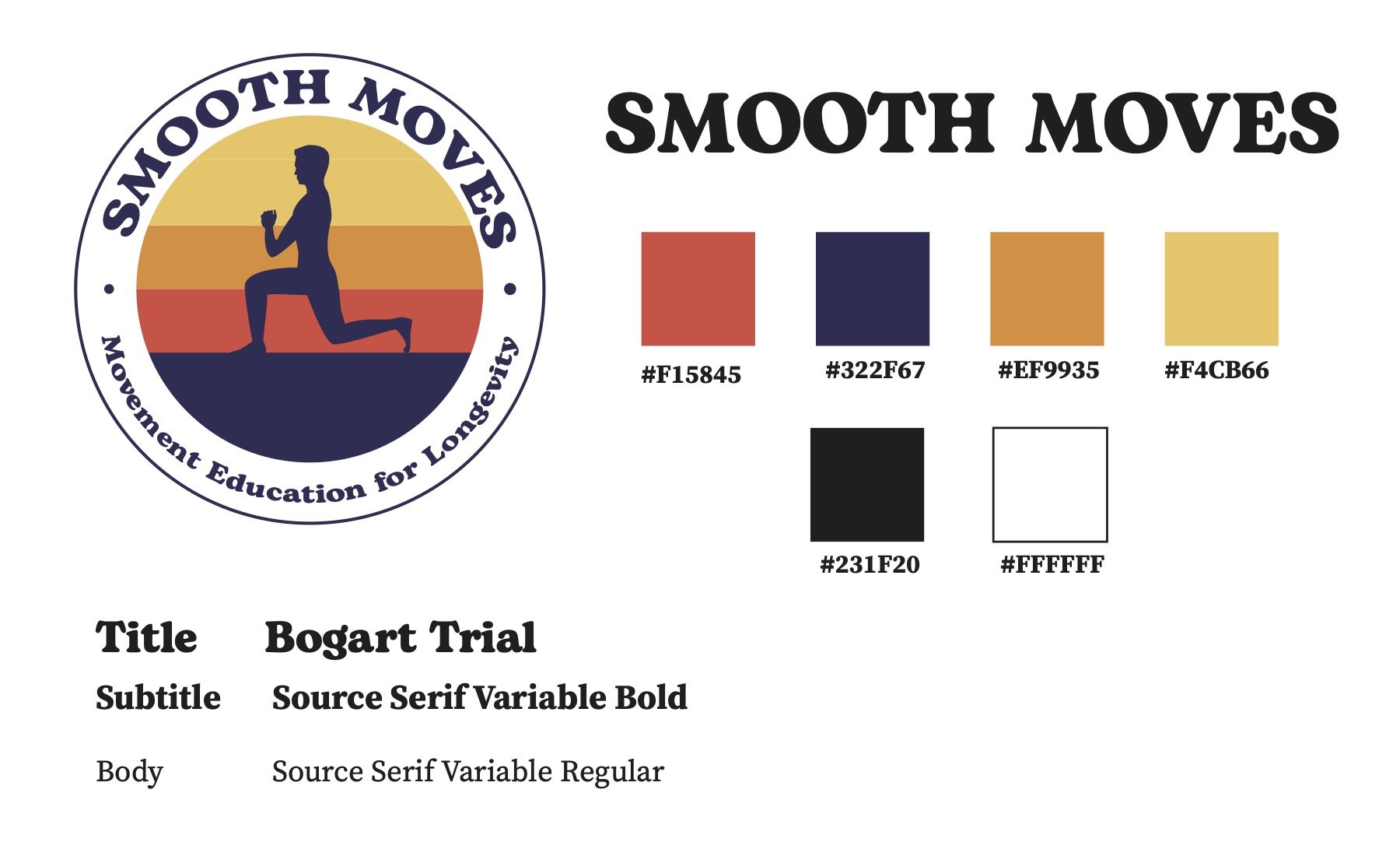
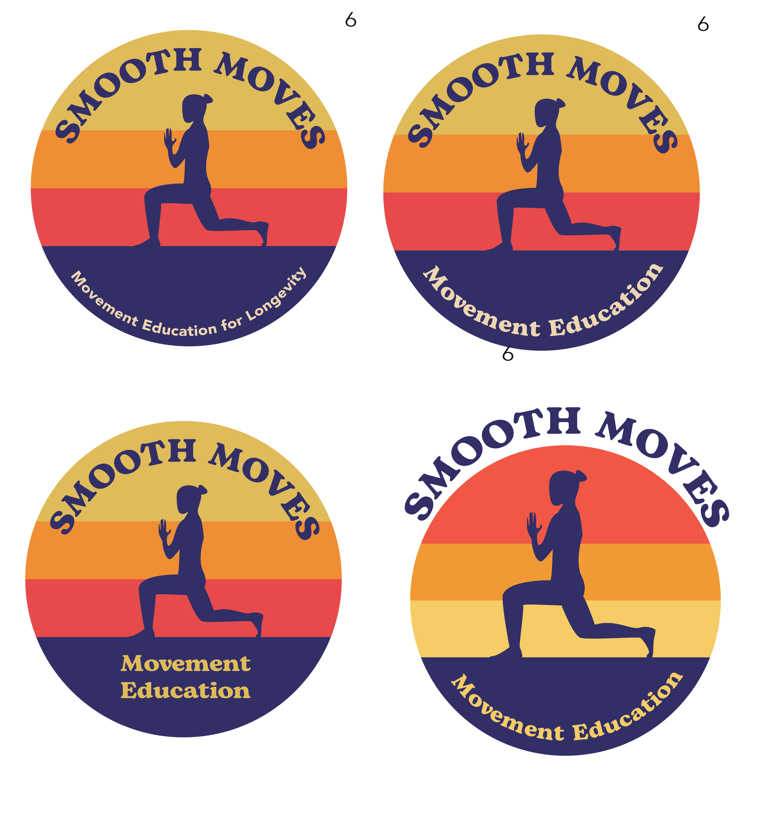
Smooth Moves is a Vermont-grown business that aims to teach “movement education for longevity”. I had the pleasure of creating a retro-inspired logo that kept a vibrant and fun vibe. The color palette is inspired by Burlington sunsets and the font ties in a nostalgic touch.


